
KeepCup
Reinvigorating
the reuse revolution.
KeepCup has a strong and sincere mission, with sustainability at the heart of everything it undertakes and produces. Having started the ‘reuse revolution’ in 2009, ten years on it needed to turn up the volume on its charge for an inclusive and responsible approach to the climate emergency and once more inspire people to reduce and reuse.

In a highly saturated sustainability landscape and a plethora of brands on a similar mission, KeepCup had to reclaim its brand name in the category as the first-to-market barista standard reusable cup.
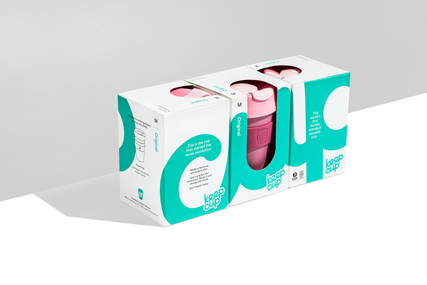
To enable the brand’s product range to grow, we needed to build on its iconic design and commitment to addressing the climate emergency, as well as define a strong range architecture and visual system that unified the range, while allowing the individual products to be clearly recognised.
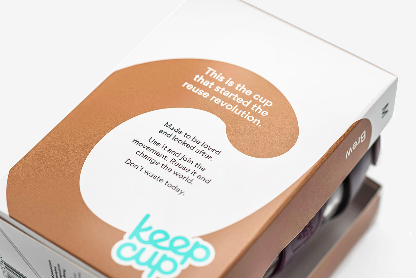
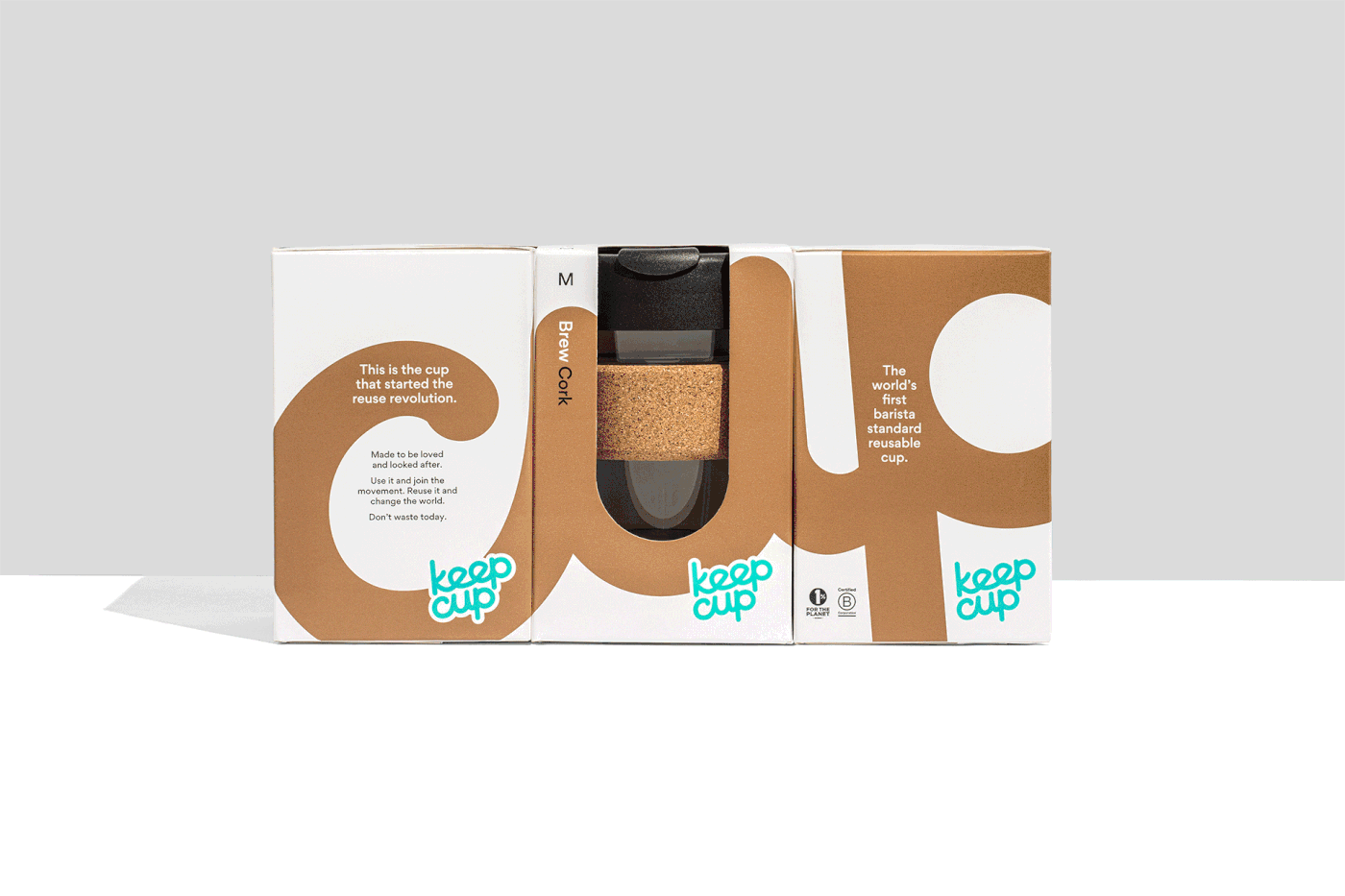
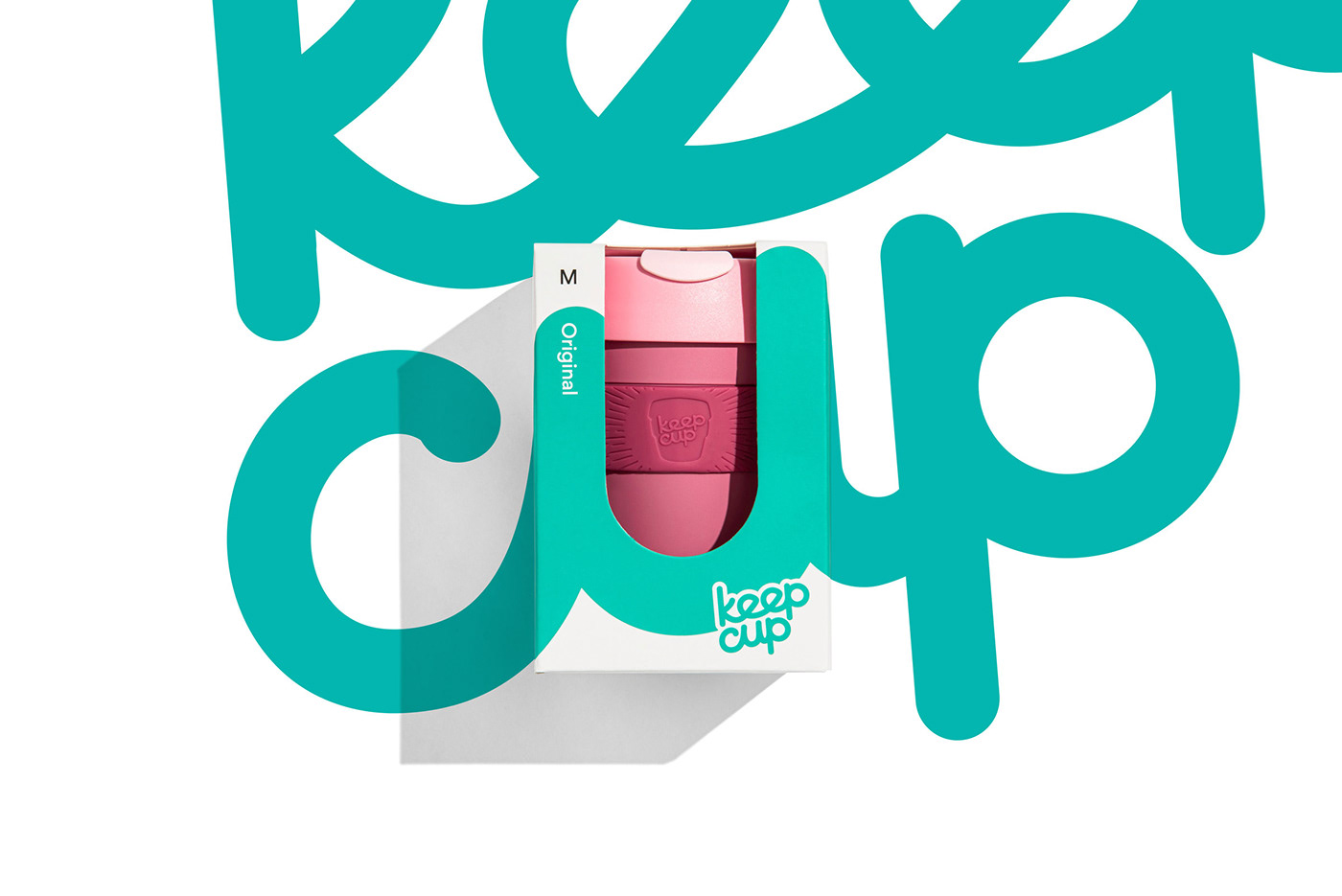
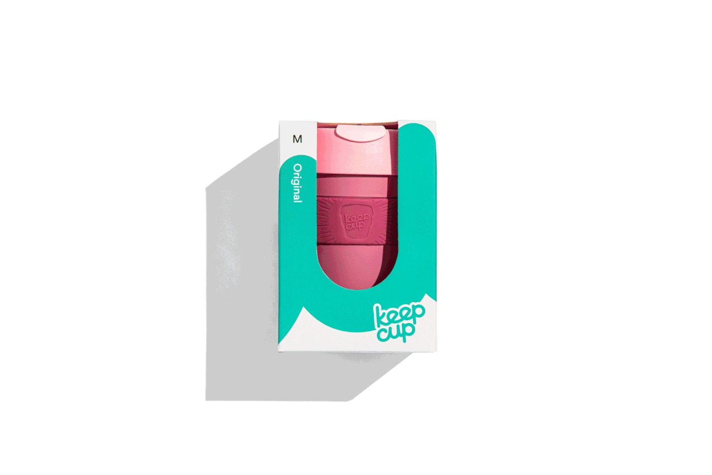
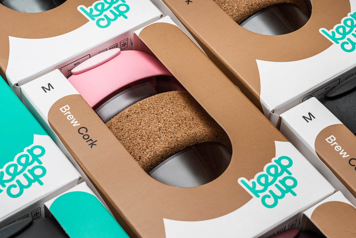
Retaining the brand’s simple, honest and playful approach to a serious issue, we redesigned the retail packaging to assert itself in the category, heroing its key brand asset – its name – to break through the competitive noise. The packaging architecture allowed for a strong wrap around design to clearly convey the punchy brand story and revised call to action:
This is the cup that started the reuse revolution. Made to be loved and looked after. Use it and join the movement. Reuse it and change the world. Don’t waste today.
To ensure ease of navigation and assure the Brew range is well protected (to minimise product breakage and waste), we created bespoke product line illustrations to clearly display the product features on the back of pack, re-enforcing the product features feasible through the packaging cut away.
The creative tells a simple, confident and compelling story with immediacy. It empowers consumers that, by making small changes, they can collectively have great impact. The brand is clearly portrayed as a leader and enabler of change, building on the ‘reuse revolution’ proposition and alluding to the KeepCup effect for strong overarching messaging off pack.
The redesign has reasserted KeepCup’s positioning and values, reduced breakages and mailer material, while creating a clear and robust range architecture, visual language and logic that incorporates future products as KeepCup continues on its mission.

Work with us
At Frost*collective, we’re all about designing a better world. We’ve been operating independently for over 25 years, working with inspiring brands and organisations across the globe. We combine specialist skills in brand, environments and place to solve complex business challenges and design experiences that enrich lives. If you'd like to work with us, get in touch.


